 Candlesticks charts are used by analysts and traders to analyse trends, reversals and corrections in a particular stock. Unlike line charts, candlestick charts track each and every movement of the markets and also help you study the psychology of the market participants.
Now the question is, how do you analyse candlestick charts to make profitable trades in the market? Don’t worry it’s not rocket science. Stick with me through the article as we explore everything about candlestick charts from basics to advanced levels.
Let’s begin.
What are Candlestick Charts?
Before we understand candlestick charts, let’s quickly touch upon the history of candlesticks. Candlesticks were first introduced in the 17th century by a Japanese rice merchant Munehisa Homma. He used to predict movements in the rice futures market. His predictions were so accurate that if we measure his wealth in today’s terms, it would be close to US$ 300 billion. Because of this, he is also known as the father of candlesticks. Later in the 1980s, Steve Nison introduced candlestick charts to the western world in his book Japanese Candlestick Charting Techniques. While it seems fancy, candlesticks are nothing but a type of chart. But unlike a line chart which plots the closing prices of a share, a candlestick chart displays all components such as open, high, low and close. So, you get to see a detailed picture of how the stock performed on a particular date. Now let’s move ahead and understand the basics of candlesticks. Take a look at the image below.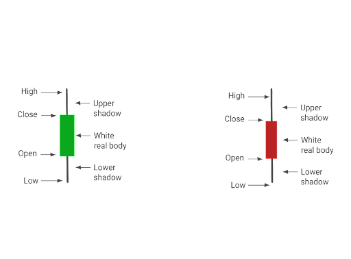 Just like a real candle, a candlestick also has a wick on top and it casts a shadow under the candle.
- The rectangular body shown in the figure is called the body of a candlestick.
- The upper shadow or the wick represents the high price of a stock in a trading session.
- The lower shadow or the lower wick represents the low price of a stock in a trading session.
- If a stock manages to close above the open price, then it is said that the bulls were victorious and the candle is painted in green colour.
- If a stock closes below the open price, then it is said that the bears were victorious and the candle is painted in red colour.
Watch the below video to explore what are candlesticks.
Recommended reading - 8 basic types of candlestick patterns you must know Now that you know what are candlesticks, let’s move ahead and understand the various types of candlestick chart patterns. Candlestick chart patterns are broadly divided into three types.- Reversal patterns
- Continuation patterns
- Indecisive patterns
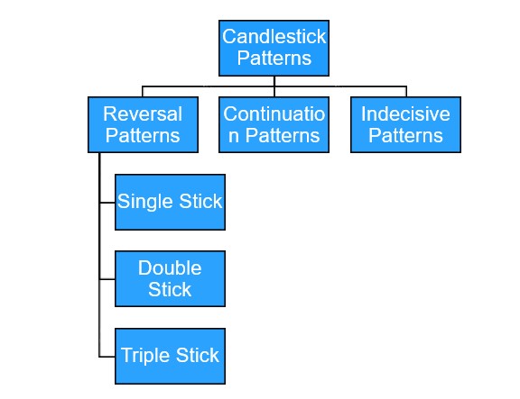 Let’s understand each of these candlestick patterns in detail.
Reversal Candlestick Chart Pattern
A reversal candlestick indicates that a particular trend has come to an end. When such formation appears during a downtrend, it indicates that there is a bullish reversal and vice-a-versa. Many a times, traders feel that, if you find a particular pattern in a chart then there is going to be a reversal. But that’s not true. There are two more stages involved in the process which will help you analyse reversals.- An ongoing trend
- Formation of a reversal candlestick pattern
- Confirmation of reversal
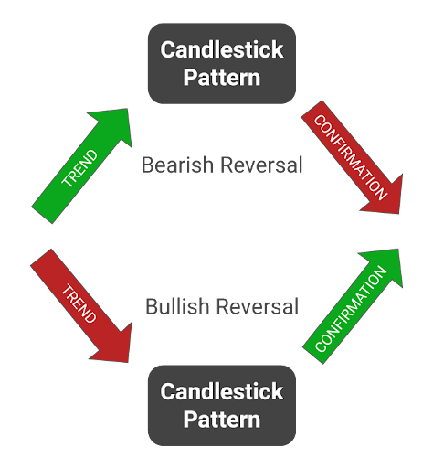
- Firstly, reversal happens only when a stock is following a particular trend. This trend could be bullish or bearish.
- Secondly, when the trend comes to an end, a reversal candlestick pattern will be formed.
- Lastly, the formation of the pattern does not guarantee a trend reversal. There needs to be a confirmation of the new trend by the candles formed in the following two to three days.
1. Hammer Candlestick
The hammer pattern indicates a bullish reversal. This candlestick has a small range from open to close and a long wick below the body which is at least twice the length of the body formed with low to no wick above. Let’s look at the hammer candlestick chart pattern formed in HCL Tech on 1st February 2021.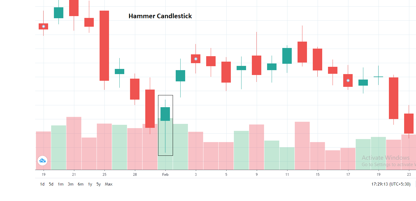
Hammer pattern found in the chart of HCL Tech on 1st February 2021
As you can see this candlestick chart pattern looks just like a real hammer. It is called a hammer because it appears at the bottom of a downward trend. Its long wick indicates that the bears failed to push the stock further down. On the other hand, the bulls were successfully able to push the price back up before the end of the trading session. The hammer candlestick can either be red or green. But, since it is a bullish reversal pattern, it is preferable that the candle should be green. Next, you will get a confirmation that there is a trend reversal. If you see that the candles formed in the next two days are trading above the high of the hammer candle, then you can say that there has been a reversal.Recommended watch: How to find reversal in stock prices using hammer candlestick pattern?
2. Hanging Man Pattern
The hanging man pattern indicates a bearish reversal and appears at the top of an uptrend. It signals that a bullish trend has come to an end. This candle is very similar to a hammer candle and has a small range from open to close. The long wick below the body should be twice the length of a real body formed. But unlike hammer candlestick this pattern forms at the top of an uptrend.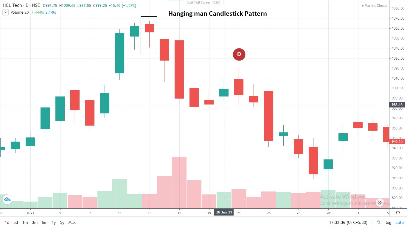
Hanging man pattern found in HCL tech on 13th January 2021
There is a reason behind the name - hanging man candle. If you look at the candle carefully, the image resembles a man committing suicide or you can rather say, a dead man. So, the hanging man candlestick indicates that the particular trend is dead. The long wick below the body means that the bears were able to dominate and push the stock price down. It is often the first sign that the bullish trend is coming to an end and the bears are stepping in to create a reversal. But a formation of a candle does not guarantee the trend reversal. Next, you need to check if the stock trades below the hanging man candles low for the next two to three days. If yes, then it is said to be a confirmed reversal.3. Inverted Hammer
As the name suggests, an inverted hammer is the inverted version of a hammer candle. It appears at the bottom of a downtrend. The difference between a hammer and inverted hammer is that an inverted hammer is just the upside down version of a hammer candle. It is also a bullish reversal pattern but not as strong as the hammer candle because the closing is near the lows. This candlestick chart pattern forms when a stock is in a bearish phase. The open and low price is almost the same, the stock then hits a new high and closes near the open price and hence it looks like an inverted hammer.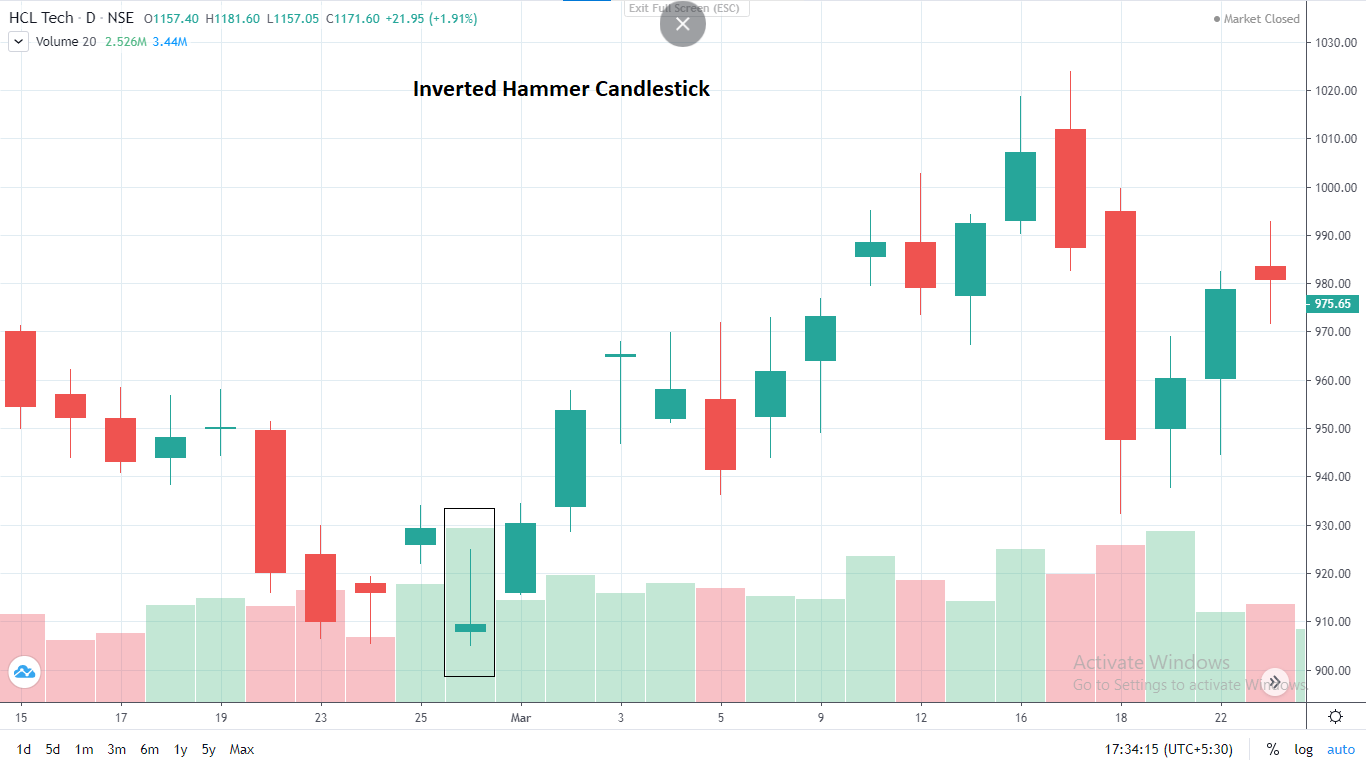
Inverted hammer pattern found in HCL tech on 26th February 2021
As you can see in the chart of HCL Tech, the candle has a small movement between the open and the close and the upper shadow is two times longer than the real body of the candle. The colour of the candle can either be red or green. But as it is a bullish reversal pattern, a green candle is preferable. If the stock trades above the high of the inverted hammer candle for the next two days, then this is a confirmation of a trend reversal.4. Shooting Star
The shooting star pattern is simply the inverted version of the hanging man. It has a small body from open to close and a long wick above the body. This pattern is seen when a bullish trend coming to an end. The long wick above the body symbolises that the bears were able to dominate their existence and stopped further bullish movement in the stock.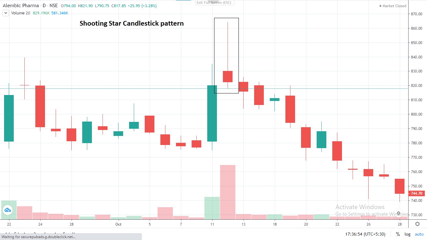
Shooting star pattern found in Alembic Pharma on 12th October 2021
This pattern is called a shooting star because it looks like a star is falling from the sky.To learn more about how to interpret an inverted hammer pattern and shooting star pattern watch the video below.
Continuation Candlestick Chart Patterns
There are a few candlesticks which indicate that a particular trend is going to sustain for a while. These candlestick chart patterns are called as continuation patterns. Let’s take a look at a few of the most popular continuation candlestick chart patterns.1. Upside Tasuki Gap
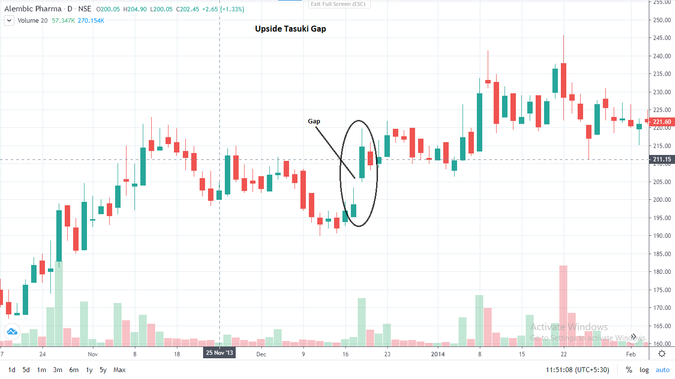
Upside tasuki gap pattern found in Alembic Pharma on 18th December to 20th December 2013
The upside tasuki gap is a continuation candlestick chart pattern which indicates that the bullish trend is going to continue. In this candlestick, a long bullish candle forms followed by another bullish candle that has given a gap up opening. The low of the second candle is above the first candle’s high. On the third day, a bearish candle opens within the body of the second candle but does not cover the entire gap.2. Downside Tasuki Gap
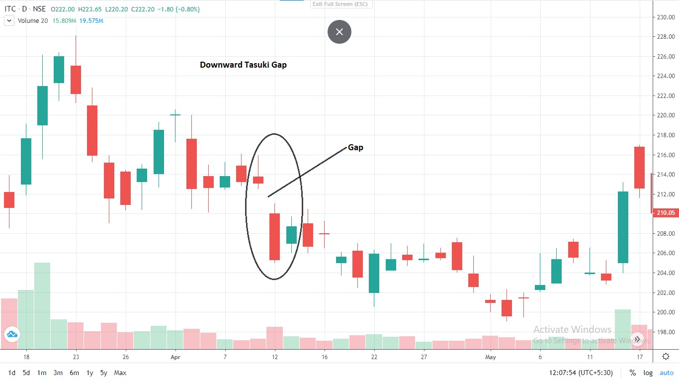
Downward Tasuki gap pattern found in ITC Ltd. on 9th April to 13th April 2021
A downward tasuki gap is the opposite of an upward tasuki gap which indicates that a bearish trend is going to continue for a while. In this candlestick, a bearish candle is formed followed by another bearish candle which has given a gap down opening. The high of the second candle is below the first candle’s low. On the third day, a bullish candle opens within the body of the second day candle but does not cover the entire gap.3. Bullish Separating Lines
Bullish separating lines is a bullish continuation pattern. It occurs when the stock is in an uptrend and might continue with the trend. This is a unique pattern where the first candle is in red and the second candle is in green. The opening price of the first candle is equal to the opening price of the second candle. If you notice, on the first day there is selling pressure and on the second day, there is a pullback and hence the candles are separating in opposite directions. The psychology behind this pattern is that the bulls were indecisive on the first day, but the next day they gained confidence and pushed the prices higher up.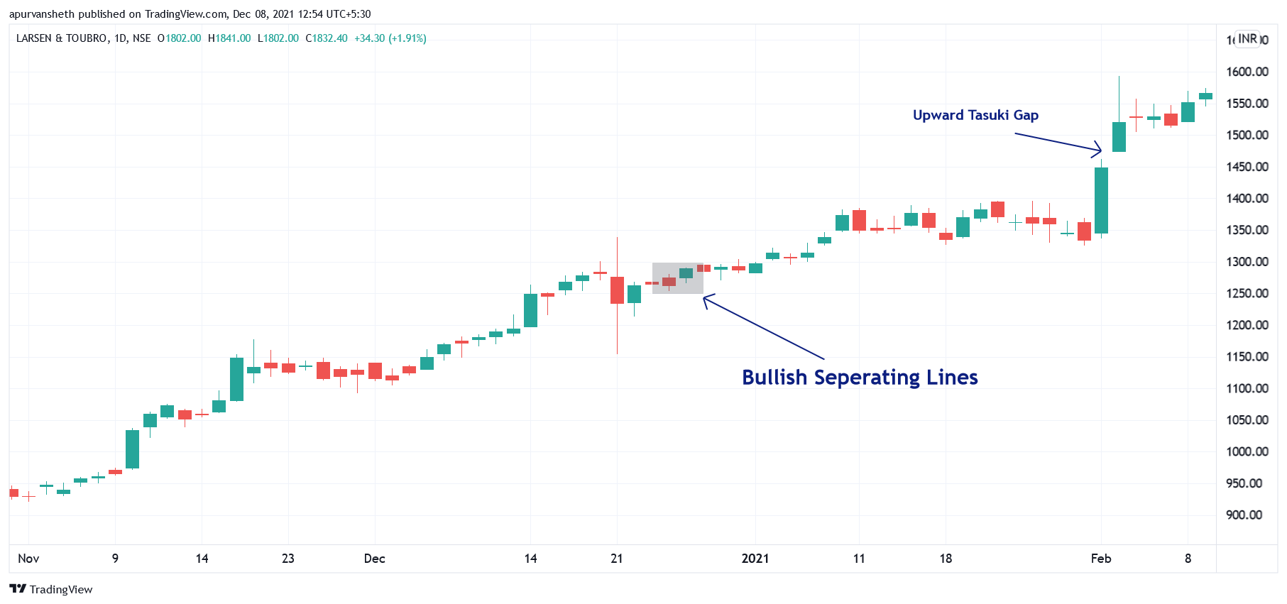
Bullish Separating lines pattern found in HCL Tech on 26th March 2021
4. Bearish Separating Lines
Bearish separating lines is a bearish continuation pattern. It shows that the stock might go on with the current downtrend. Here, the first candle is green and the following candle is red. The opening price of the first candle is same as the opening price of the second candle. As this is a bearish continuation pattern, the bears are trying to take the upper hand. But on the first day, the bulls somehow succeed to push the prices up. Later on the second day, the bears seize control again and the stock opens at the same price as the previous day under the influence of the bears and the bearish trend is expected to continue.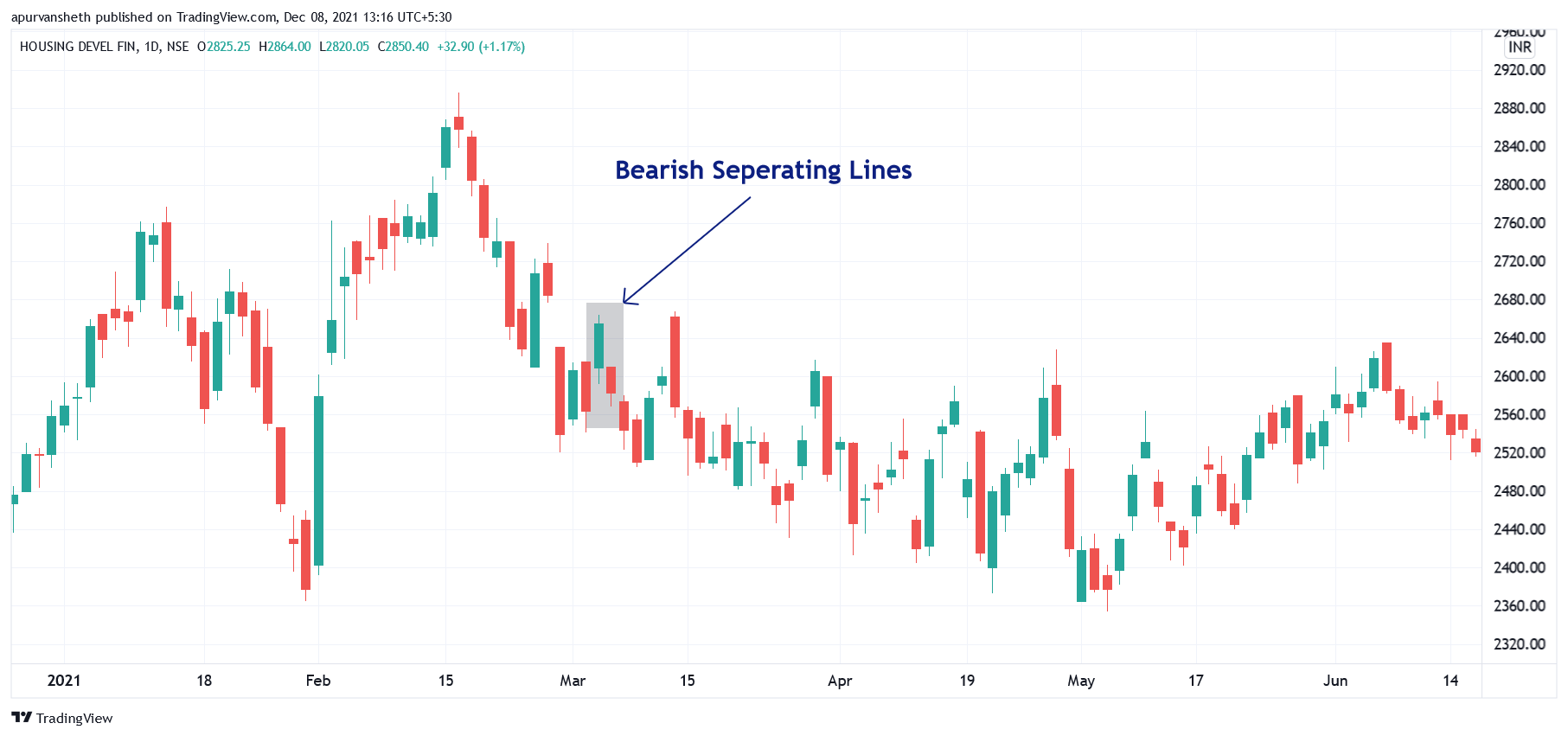
Bearish Separating lines pattern found in HCL Tech on 31st December 2018
5. Rising Three Methods
The rising three methods is bullish continuation pattern. Here, the first candlestick is a long bullish candle followed by three small candlesticks either in red or green colour. The range of the three short candles is smaller than that of the long green candle. After the short three candles, a long green candle is formed again and it completes the pattern.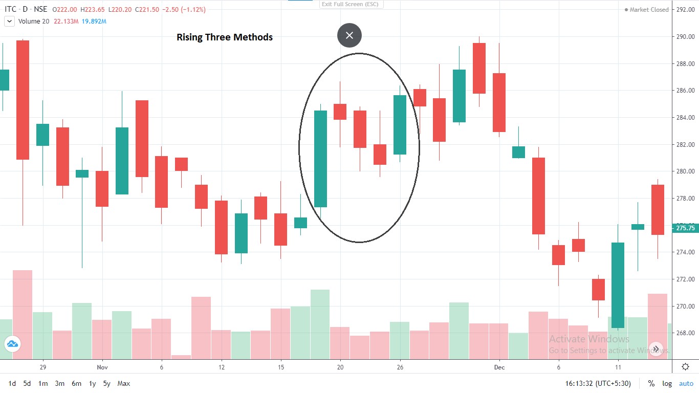
Rising three methods pattern found in ITC Ltd.
6. Falling Three Methods
The falling three methods is the opposite of rising three methods. It is a bearish continuation pattern and hence, it appears in a downtrend. The first and the last candle is a long bearish candle with three small candles in the middle.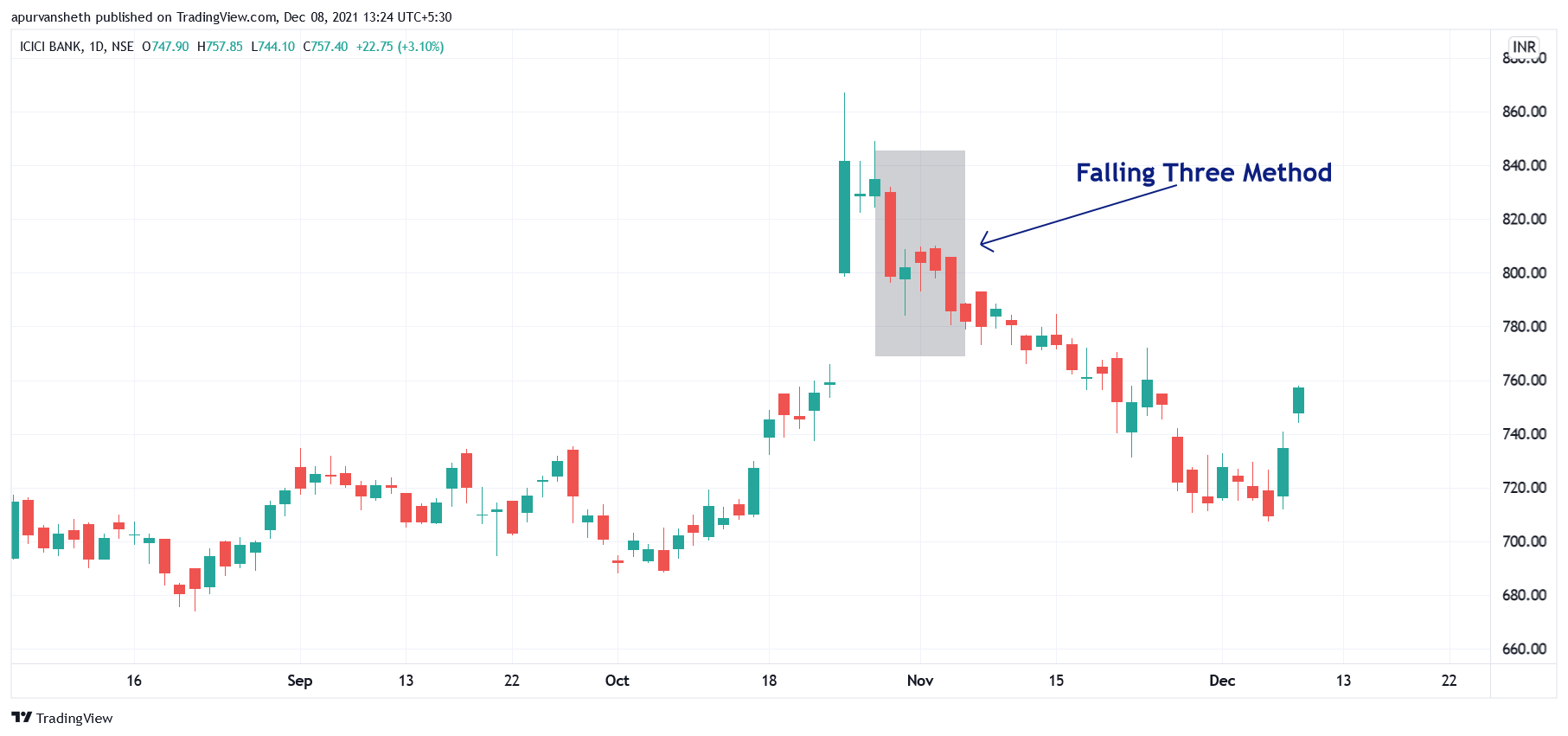
Falling three methods pattern found in ICICI Bank.
Indecisive Candlestick Chart Patterns
1. Doji Pattern
The Doji candle is formed when the open and close of a stock is virtually equal. Moreover, there is a long shadow above and below the body of the candle. It indicates confusion or tug of war between the bulls and bears and nobody knows what is going to happen next.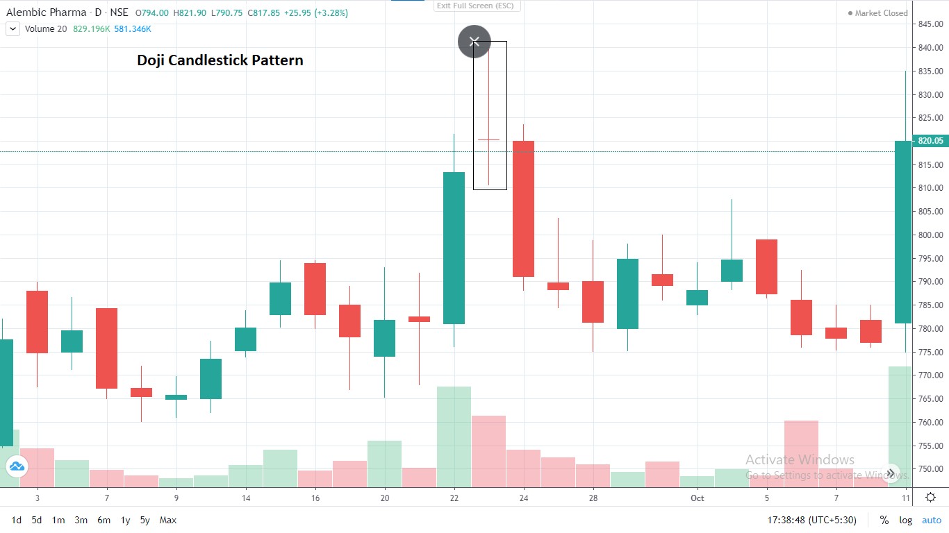
Doji Candlestick found in Alembic pharma
2. Spinning Top Pattern
The spinning top candlestick chart pattern signals indecision amongst buyers and sellers, as neither the bulls or the bears have the upper hand. Hence, it is also known as a neutral pattern. Now you must be thinking what’s the difference between a spinning top and a doji? Well, the body of a spinning top candle is slightly bigger than a doji candle. Let’s take a look at the spinning top pattern in Alembic pharmaceuticals.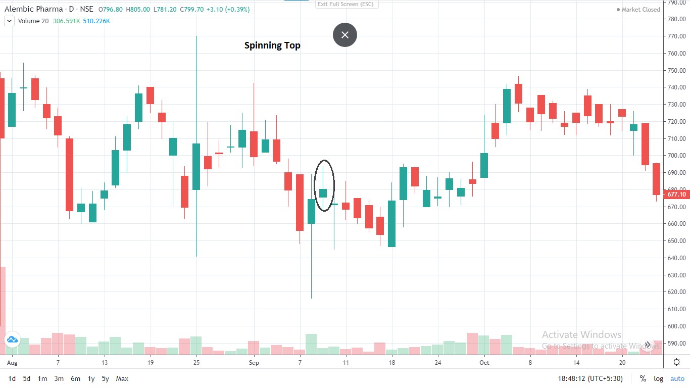
Spinning top pattern found in Alembic Pharma
This ends our discussion about the three major types of candlestick chart patterns. But there are so many more patterns you must learn about such as bullish engulfing, bearish engulfing patterns, morning star patterns and a lot more.Our Chief Markets Editor, Apurva Sheth has explained about these candlestick chart patterns in a very simple way.
Watch these videos to learn more about candlestick chart patterns.
To get access to the full course on candlestick chart patterns from the very basics, take a look at this playlist. Open a Demat and trading account with Samco – The best discount broker in India and create wealth by analysing candlestick chart patterns.Happy Trading


 Easy & quick
Leave A Comment?